Revitalizing INSP’s Weekly Newsletter:
Client: INSP | Software: Figma | Type: Research and Analysis

The Project
Tasked with enhancing the open rates and retention of INSP’s weekly newsletter, I conducted a thorough analysis of the current design, engagement statistics, and user feedback. The objective was to propose actionable improvements to increase user engagement and overall value.
Challenges and Problems:
Identifying Issues:
The existing newsletter design was outdated, with declining engagement metrics and rising unsubscribe rates. Users were overwhelmed by excessive content and random links, leading to confusion and disengagement. The lack of a clear message or Call to Action (CTA) further diminished user interest.

My Role:
Comprehensive Analysis:
I collaborated with the analytics team to review open rates, click rates, unsubscribe metrics, and visit duration. By examining several months of email campaigns, I analyzed the placement, design, and content effectiveness of images and text.
Stakeholder Communication:
I compiled an analysis packet to present the findings to stakeholders, illustrating how current practices impacted user experience. The report included data-driven insights and proposed multiple improvements to enhance the newsletter’s look and feel.
Proposals and Recommendations:
Focused Content and CTAs:
The analysis revealed a lack of effective CTAs and an overwhelming amount of content. Notably, mobile users engaged more with content despite fewer opens, indicating a need for mobile-friendly design enhancements. I proposed standardized buttons for CTAs, with larger buttons for featured content and smaller, consistent buttons for other items. Enhancing button contrast was also recommended to improve visibility.

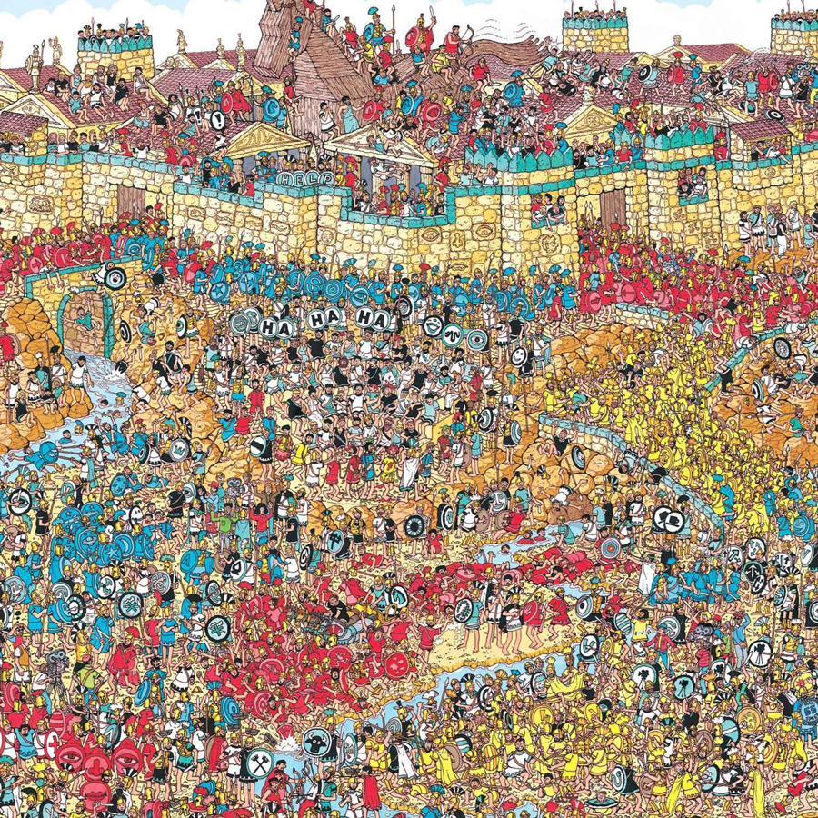
Visual demonstrations help to get a point across.
Simplified Design:
To address content overload, I suggested a more focused layout, prioritizing key elements that entice users to visit the website. This approach aimed to capture user attention quickly and direct them to the site for further engagement.

Visual Clarity:
Using visual examples, I demonstrated the importance of contrast and simplicity. A comparison exercise showed stakeholders how a well-defined CTA stands out, while cluttered content leads to user disengagement. This exercise underscored the need for a streamlined design that highlights important elements.
New Layout and Consistency:
Emphasizing Focus, Flow, and Consistency, I proposed a layout with prominent CTAs and streamlined content. The goal was to reduce clutter, create visual hierarchy, and ensure a cohesive design that aligns with user expectations.
Outcome and Impact:
Increased Engagement:
Many of the proposed changes were implemented in subsequent newsletters, resulting in a simpler, more streamlined design with more prominent CTAs. While open rates remained steady, there was a significant increase in click-through rates, indicating improved user engagement and interest.
Enhanced User Experience:
The revamped newsletter design provided a clearer, more enjoyable reading experience, encouraging users to interact with the content and visit the website for more information. The focus on visual clarity and consistent CTAs effectively addressed previous issues and enhanced overall user satisfaction.
Comments are closed.