Redefining the INSP.com Homepage:
Client: INSP | Software: Figma| Type: Revision

The Project
While awaiting a full website redesign, I proposed a “Redefine” project to enhance the user experience on INSP.com. The goal was to implement strategic tweaks, focusing primarily on the homepage, to improve user engagement and satisfaction during the interim period.
Challenges and Problems:
Design Inconsistencies:
The existing homepage was sparse, with a standard hero image, taskbar, and a few content posts. The design included excessive white space and an inconsistent sidebar, resulting in a lackluster and unengaging user experience. The page looked more like a basic-cable site rather than a polished network television website.
Font Size and Readability Issues:
Font sizes were too small for the older demographic that forms a significant portion of INSP’s audience. This made the content difficult to read and likely contributed to higher exit rates and lower engagement.
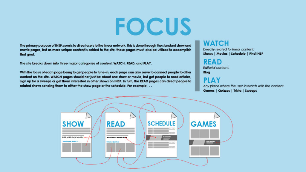
Lack of Clear Focus:
The homepage did not effectively highlight the breadth of content available on the site. There was a single banner ad below the fold, missing an opportunity to showcase popular shows, blog posts, or new features. The hero image and CTAs were inconsistently styled, further detracting from the site’s cohesiveness.
User Engagement and Technical Issues:
Analytical data revealed poor performance of ‘below-the-fold’ content and suboptimal user flow. The site lacked user-friendly error messages and mobile optimization, causing users to abandon the page.
Research and Analysis:
In-depth Analytics Review:
I worked with the analytics team to analyze user behavior, including open rates, click rates, exit rates, and visit duration. The research focused on understanding how different page elements were performing and identifying key areas for improvement.
User Behavior Studies:
By studying user behavior, especially among the older demographic, I identified the need for larger fonts, clearer call-outs, and a streamlined layout. This helped in designing an interface that catered to their specific needs and habits.
Design Trends:
Incorporating the latest design trends, I proposed enhancements that would make the site more visually appealing and user-friendly, ensuring it remained competitive and engaging.
Proposals and Recommendations:
Enhanced Content Display:
The new design proposed adding more content directly under the fold, featuring popular shows, blog posts, and new site features in organized sections: Watch, Read, and Play. This approach aimed to provide users with immediate value and direct them to key areas of the site.
Consistent CTAs and Visuals:
To address the lack of focus, I recommended standardized, prominent CTAs and a consistent style for the hero image. These changes aimed to create a cohesive look and feel, making it easier for users to navigate and engage with the content.
Improved Readability:
Larger fonts and higher contrast colors were suggested to enhance readability, particularly for the older demographic. This would make the site more accessible and reduce exit rates.
Outcome and Impact:
Increased Engagement:
The proposed changes resulted in higher user engagement, with more users staying on the page longer and reduced exit rates. The enhancements improved the overall user experience, making the site more inviting and easier to navigate.
Alignment with Full Redesign:
Interestingly, the redefine project’s suggestions aligned closely with the upcoming full site redesign by an external company. This demonstrated the effectiveness of the proposed improvements and validated the strategic direction taken.
Key Takeaways:
This project underscored the importance of user-centric design, consistency, and data-driven decision-making. By making targeted improvements based on thorough research, the user experience was significantly enhanced, leading to higher engagement and satisfaction.

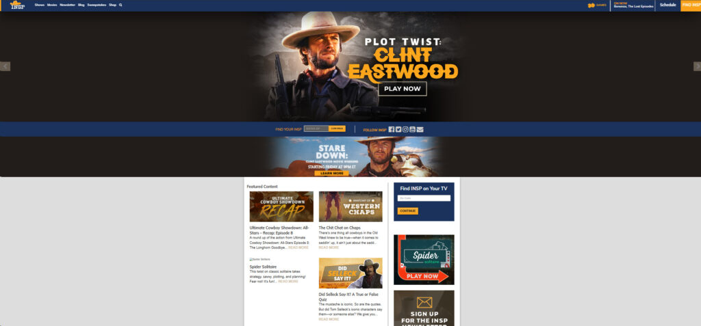
The new design.
Comments are closed.