Hi, I'm Cory D. Wright, a Senior UX/UI Designer, Artificial Intelligence Specialist, and Animation & Production Guru. My passion is creating intuitive, data-driven designs that solve real-world problems with creativity and innovation.
AI Portfolio Animation/Motion Portfolio Resume LinkedIn Contact me


Problem
Job seekers were struggling to keep track of multiple applications, interviews, and status updates in a simple, centralized way. The challenge was to create a solution that would streamline this process while being intuitive and mobile-friendly. To bring this solution to life, I taught myself Android Studio, taking full ownership of both the design and development phases.
Research and Discovery
Through user interviews and market research, I identified the key frustrations job seekers faced: the need for visual tracking, quick updates, and accessible application information on the go. This research shaped the app’s core functionalities and UX. Leveraging AI Language Learning Models (LLMs), I also enhanced my ability to quickly code and prototype features in Android Studio.
Ideation and Wireframing
Starting with sketches and wireframes, I focused on creating a clean, intuitive layout that would allow users to quickly add new jobs, track their application status, and easily update information. The design centered around visual clarity and minimizing user effort. AI-assisted coding played a key role in converting wireframes into a functional prototype swiftly.
Prototyping and User Testing
After building an interactive prototype, I conducted user testing to validate the design. Feedback led to improvements in the navigation, such as adding a search function and refining the color coding system for job statuses to enhance usability. I used AI LLMs to assist in refining the code based on user feedback, ensuring quick iterations and more efficient development.
Design and Development
Learning Android Studio from scratch, I designed and developed the app entirely on my own. Using AI to assist in coding tasks, I ensured the UI was fully responsive across mobile devices, focusing on maintaining the visual hierarchy and easy touch interactions for job updates and status changes.
The Solution and Impact
The final app allows job seekers to track applications with ease, providing a visual overview of their job search. The app is currently in the closed testing phase, but initial feedback has been very positive, with users praising its simplicity and functionality. Early testing shows that 85% of users feel more organized in their job search after using the app.
Future Enhancements
Looking ahead, I plan to introduce a resume upload feature and integration with LinkedIn to further streamline the job search process. As the app moves towards public release, AI will continue to assist in the development of these features, helping to iterate and implement them quickly.
Problem
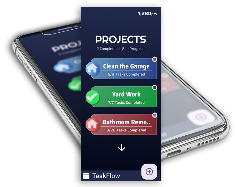
As both a designer and a home project enthusiast, I was always looking for a list app that fit my workflow. However, none of the existing solutions had the specific features I needed to organize my projects effectively. So, I decided to create my own! The goal was to help break down large projects into simple, easily achievable tasks, creating a flow that leads to project completion—a 'Task Flow' if you will.
While plenty of task and list apps exist, TaskFlow stands out due to its unique organization, user interface, and incentive features that drive productivity.
Approach
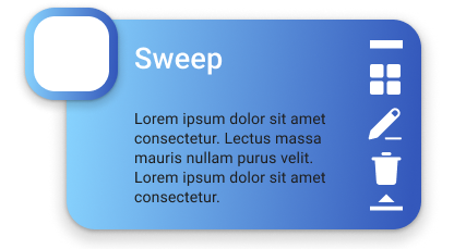
I wanted the app to feel simple but powerful, with large, prominent titles and buttons for ease of use. At the same time, it needed enough depth and features to make it functional for a variety of projects. The main focus was on a UI that allows each project to stand out visually, showing key information—like the number of tasks left—at a glance.
Process
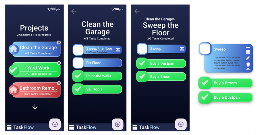
My design process typically starts with sketches, Figma, or Figjam, but for TaskFlow, I jumped straight into Figma to begin creating screens. I believe interacting with a design as you create it helps you better understand the user experience, and Figma’s prototyping features allowed me to test and iterate on the flow as I designed it.
Result & Current Status
Although TaskFlow is still in the design phase, the app’s early Figma prototypes have demonstrated a user-friendly experience and a unique flow that breaks projects into manageable tasks. This project showcases my design skills, research abilities, and leadership in guiding AI-driven development processes. By identifying gaps in existing apps, I've been able to create something new that caters to users like me who want a simple yet powerful way to manage projects.
Problem
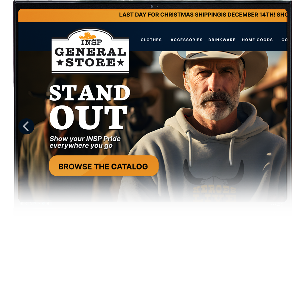
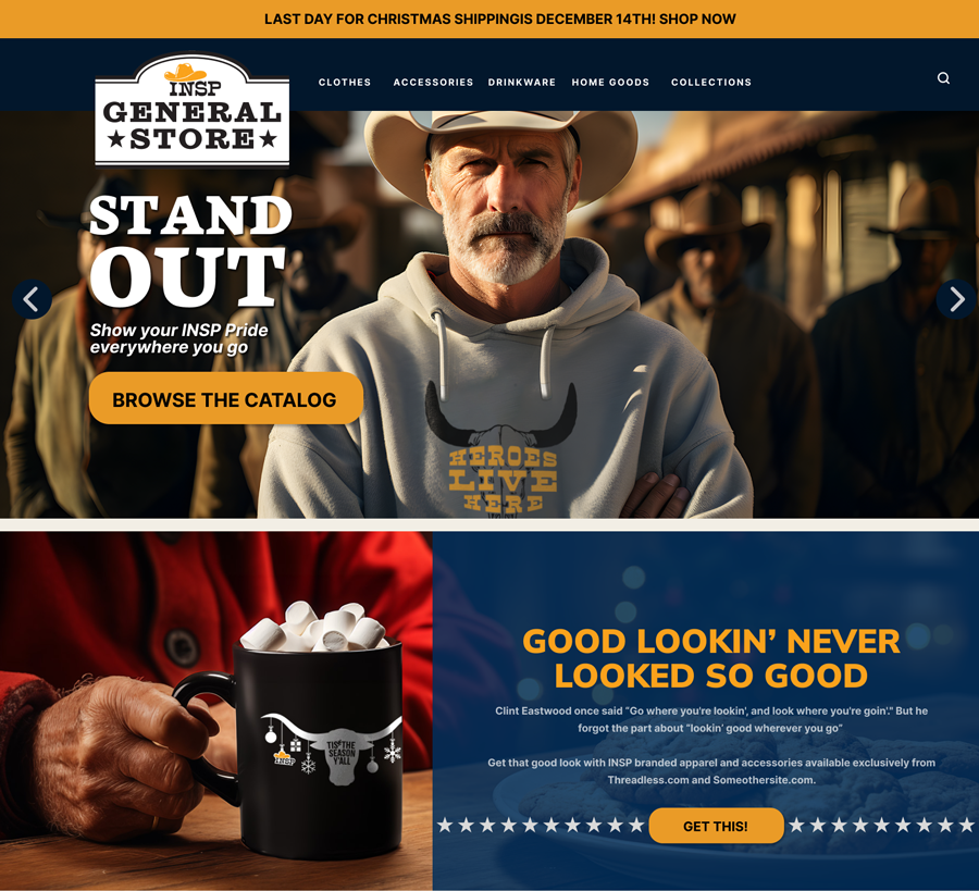
INSP, a western-themed television station, wanted to promote their network through an online store selling branded merchandise like t-shirts, hats, and even bath rugs. As the Senior UX/UI Designer, I was tasked with creating the mockups for this shop. What began as a simple e-commerce task quickly evolved into something more significant—an innovative solution for selling to INSP’s primary demographic of 60+ viewers.
The challenge? Creating a 'no-shop shop.' The network didn’t want to handle packaging or shipping, and all transactions were routed to external sites. My task was to design an online store that was intuitive for older users, who could browse products seamlessly and complete transactions on multiple third-party sites without confusion or hesitation.
Approach
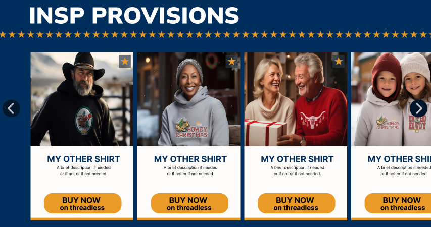
The first step was to find reliable print-on-demand and drop-shipping companies that could fulfill orders. But the real design challenge was ensuring that users—many over 65—would trust and feel comfortable navigating a site that took them to unfamiliar external sites for purchases.
The Start of AI Integration
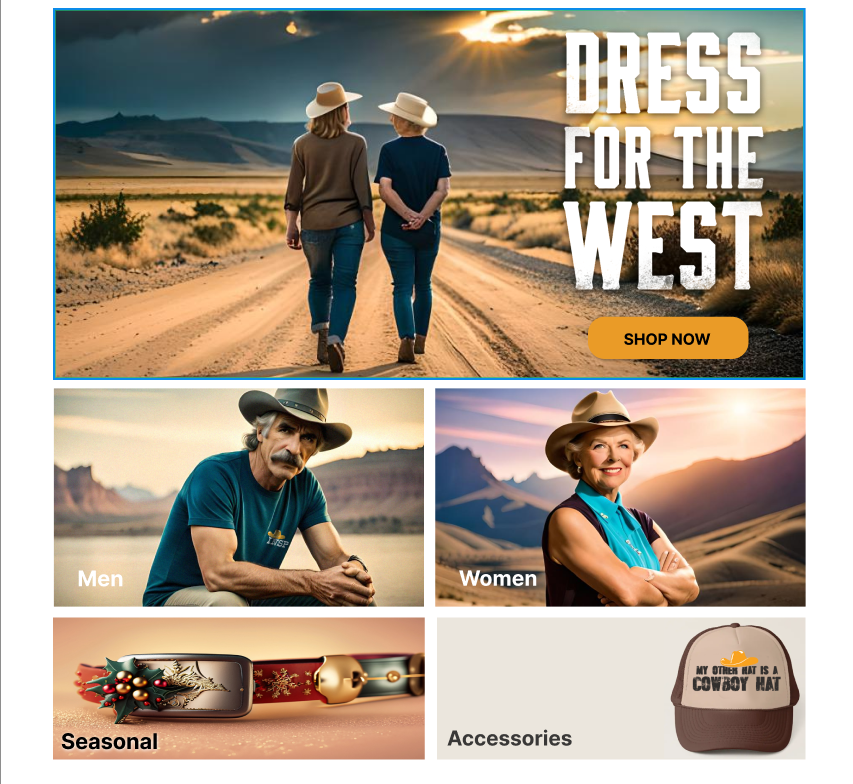
During the prototype phase, I began experimenting with early generative AI models to fill in the gaps for imagery. While the initial results were basic, it allowed me to demonstrate to stakeholders the potential of using models in our key demo to better represent the brand.
As AI models rapidly improved, I proposed AI-generated imagery as a cost-effective alternative to photoshoots. This allowed us to create custom visuals without the need for expensive production, saving thousands of dollars in marketing and design costs. This shift led to increased profitability for the store and sparked broader AI adoption across the company.
Process
My design process started with creating mockups and prototypes in Figma. I presented these to stakeholders, including company VPs and EVPs, and incorporated their feedback. Working closely with the product manager, I collaborated with both front- and back-end developers to bring the designs to life in an Agile environment, complete with bi-weekly Sprints and weekly SCRUM sessions.
I also led User Acceptance Testing (UAT), ensuring that the final product met the needs of our users and stakeholders alike. The entire project emphasized ease of use for older audiences, a consistent user flow, and trust-building throughout the shopping experience.
Result
The result was an innovative online store that created a new revenue stream for INSP while increasing site engagement by 12%. By wearing branded apparel, viewers became walking advertisements for the network, creating a new layer of brand visibility.
My biggest achievement, however, was integrating generative AI into this project and showing upper management the potential for AI in other areas of the business. This led to the adoption of AI across marketing, design, production, and development teams, transforming the company's workflow and reducing costs.
This is the full description of the Imagicomm Affiliates project. You can format this content with HTML.
Challenge
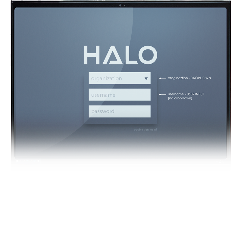
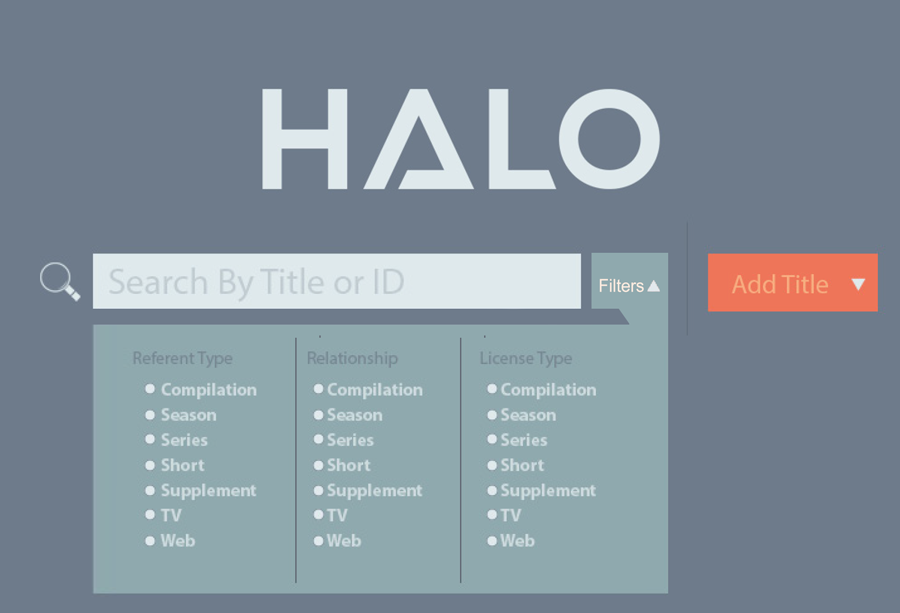
Halo is an internal web-based application designed to archive, catalog, and reference every piece of content aired on INSP Television. It needed to serve multiple company levels while integrating with external platforms via APIs to automate schedules and distribute content efficiently.
The primary design goal was to create an intuitive interface capable of handling a vast array of data, including show titles, cast and crew information, videos, images, air-dates, and internal content access. The challenge was not just managing this data but ensuring that it could be easily retrieved, searched, and displayed in a way that suited the specific needs of different user groups.
Approach
Given the highly targeted user base, I took a direct approach to user research. Rather than broad studies, I conducted detailed interviews with all potential users, focusing on their unique workflows and requirements. This allowed me to tailor the design specifically to their needs, avoiding unnecessary features while enhancing usability.
Working closely with stakeholders, developers, and end-users, I integrated the design into the existing development framework. This required fine-tuning core functionalities, such as database interactions and user management features, ensuring a smooth user experience that aligned with the system’s technical capabilities.
Result
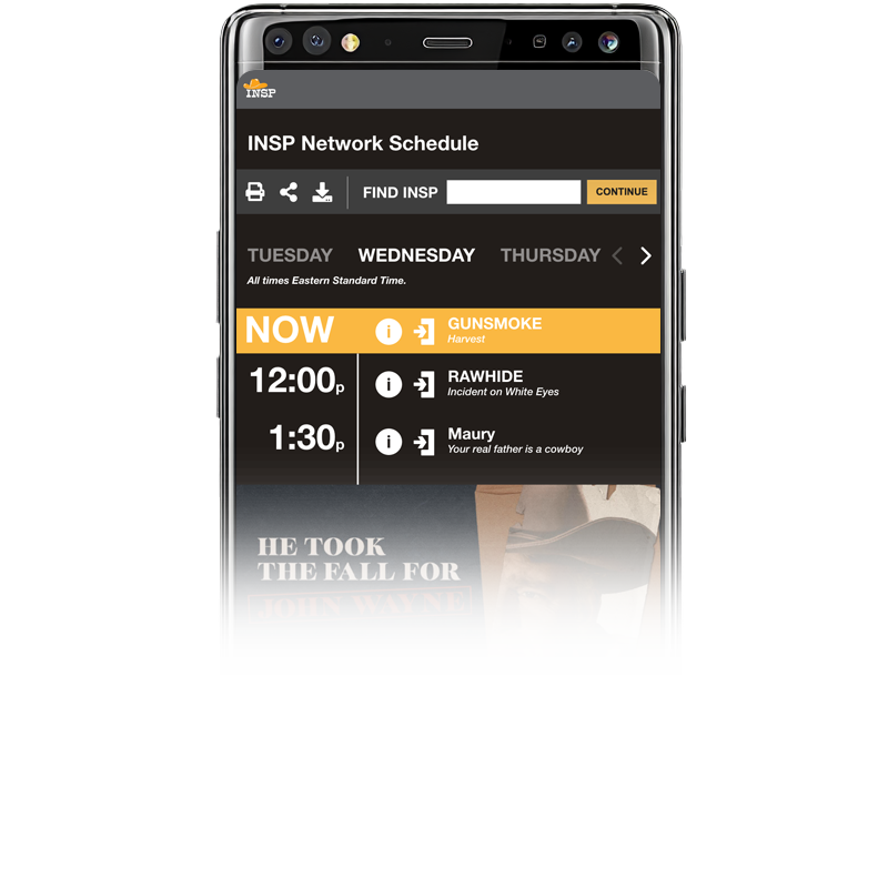
The final product exceeded its initial scope, becoming the central tool for accessing program data across the company. Halo now serves a wide array of internal users and external platforms, providing consistent and reliable data access. Users can efficiently search for and retrieve information on airings, cast details, or promotional materials, greatly improving workflow and operational efficiency.
One of the standout features is Halo’s API integration, which allows external sites to extract and display show data automatically. This ensures that content is consistently represented across all platforms, aligning with the brand’s standards.
This project highlights my ability to design complex, user-centered systems, manage extensive data requirements, and collaborate across departments to deliver a solution that not only meets but exceeds the needs of the business.
Problem
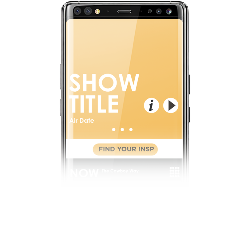
The existing INSP homepage was visually sparse, featuring a standard hero image, taskbar, and a few content posts. Excessive white space and an inconsistent sidebar led to a lackluster user experience, making the site feel more like a basic cable network rather than a polished television website.
Font sizes were too small for the 60+ audience, which forms a significant portion of INSP’s viewers. This contributed to poor readability, likely driving higher exit rates and lower engagement. Additionally, the homepage did not effectively highlight the range of available content, missing key opportunities to showcase popular shows, blog posts, or new site features. The hero image and CTAs were inconsistently styled, creating a fragmented appearance.
Analytics revealed poor performance of below-the-fold content and an inefficient user flow. The site also lacked mobile optimization and effective error messaging, causing users to abandon the page.
INSP.com presented another interesting aspect; although it was a network TV website, it didn't want to just focus on the shows and movies on the network. Games, articles, and even a new shop feature were given just as much attention os the programming. The point of these was to retain users by given them more to do on the site and keep them coming back, but it also made for a lot of content to showcase.
Approach
I collaborated closely with the analytics team to assess user behavior metrics such as click-through rates, exit rates, and time spent on the page. This research focused on understanding how various page elements performed and identifying areas where user experience could be improved.
Through this analysis, particularly of older users, it became clear that larger fonts, clearer calls-to-action, and a more streamlined layout were necessary. I incorporated these findings to design an interface that catered to this specific demographic while also aligning with modern design trends.
By proposing a visually appealing and user-friendly redesign, I aimed to create a more engaging experience that would encourage users to stay on the site longer and explore more content.
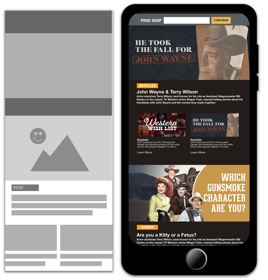
Process
My new design proposal focused on reorganizing the homepage to prioritize content directly below the fold. This included sections for popular shows, blog posts, and new site features, categorized into ‘Watch,’ ‘Read,’ and ‘Play.’ These changes were intended to provide users with immediate value and guide them to key areas of the site.
To create a more cohesive look and feel, I standardized the CTAs and ensured consistent styling for the hero image. This not only improved the visual flow of the page but also made navigation simpler and more intuitive.
Recognizing the importance of accessibility, I recommended larger fonts and higher contrast colors to enhance readability for older users. These changes were aimed at reducing exit rates and improving the overall user experience.

In addition to overall layout, I also promopsed changing a few aspects of how Creative provided Hero images for the homepage. Making more constistent design choices, and having aspects of the image be pre-coded into the template, made for a better flow and let the user focus on what was important.
Result
The redesign led to higher user engagement, with more users staying on the page longer and fewer abandoning the site. Exit rates decreased, and the improved user experience made the site more inviting and easier to navigate.
Interestingly, the changes I proposed were closely aligned with a full-site redesign later executed by an external company, which validated the strategic direction and effectiveness of my suggestions. This alignment demonstrated the impact of data-driven design decisions and reinforced the importance of user-centric design.
Overall, this project highlighted the power of research-based, targeted improvements. By focusing on consistency, accessibility, and user needs, the homepage redesign significantly enhanced user satisfaction and engagement.
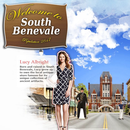
At the time, the company was using the same website template for each of their original movie websites. While this saved time, it made the experience for the user dry and uninspired. Plus, since the design was generic, it didn't allow for the character of the movie to come through. I prepared this document to illustrate the point to managers and project owners and give some alternate ideas.
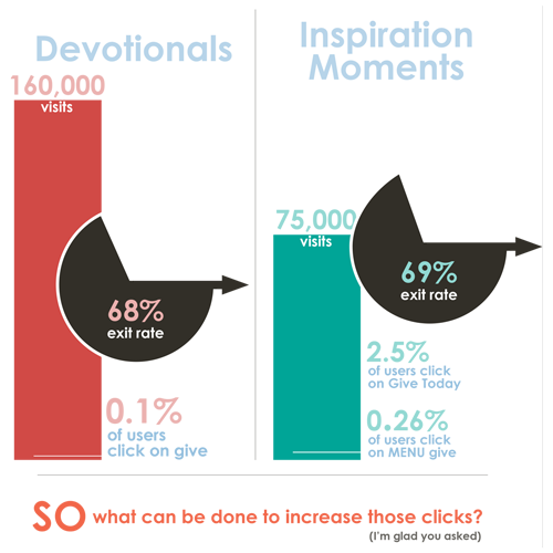
Inspiration.org had already gone through a redesign led by myself. However, after being live for awhile, we looked at the statistics and realized some areas were not performing as they should. So, I went through the site, the statistics, and developed a plan to help increase engagement on some of these areas. Websites are a living entity in many ways, and need to be updated, redefined and redesigned as the users needs change and evolve.

Occasionally, whenever a contract expires, cable companies and networks spend a lot of time renegotiating contracts. One way networks like INSP ensure they have a little leverage over the cable companies is to get their viewers involved. The "I want my INSP" page in 2019 needed a lot of work. It was a text heavy page with nothing to grab users attention to act. This packet was put together to give some statistics and ideas of how to improve engagement.
Problem
INSP.com was in need of a full redesign, both for the front end and the admin area. The existing site relied on a large number of templates for various sections, but over time, these templates lost consistency with the rest of the website. Some templates were outdated, while newer ones didn’t align with the overall style, leading to a fragmented user experience.
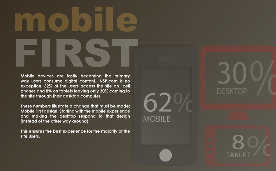
Additionally, the system made it difficult for content managers to create pages quickly. New sections required developers to create entirely new templates, which slowed down the process for promotions, sweepstakes, and other time-sensitive content updates.
Approach
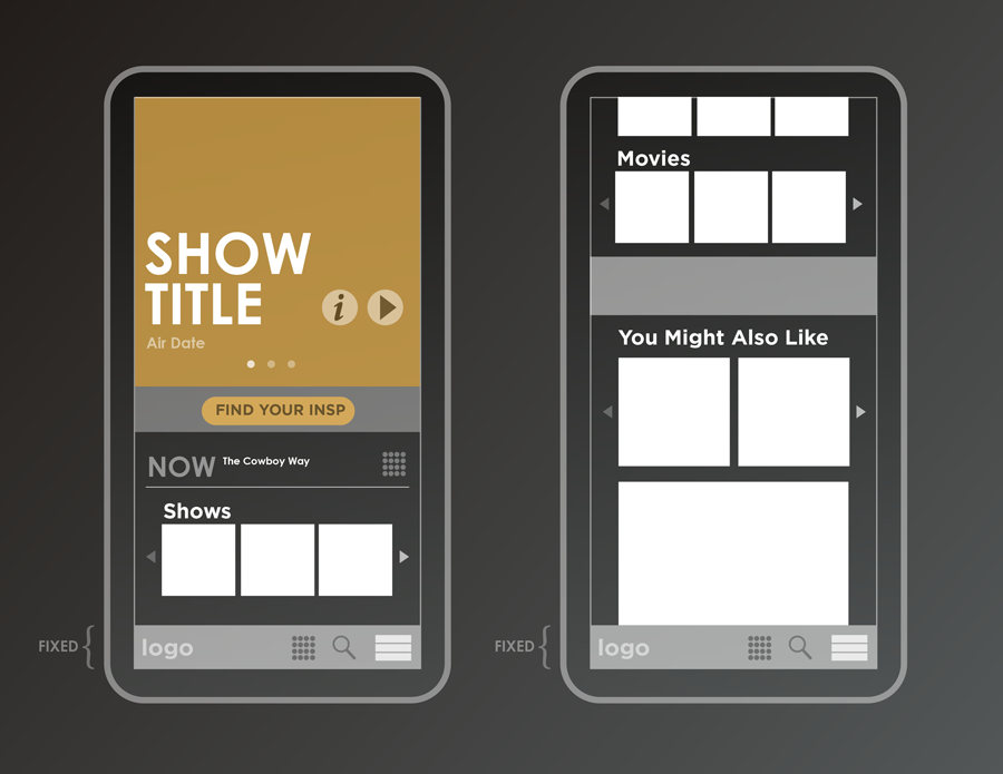
My goal was to simplify the structure of the site, making it easy for admins to manage content and create new pages as needed without relying on developers. After analyzing the current state of the site, I proposed reducing the complexity down to just one template (with modular elements), allowing for consistency and flexibility across the entire site.
Process
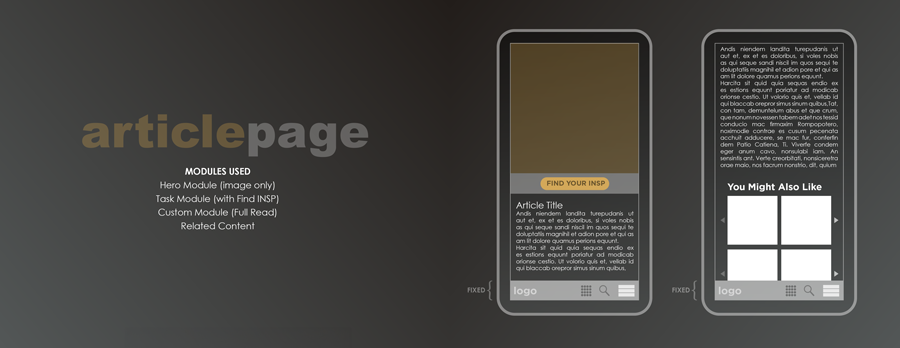
To ensure simplicity and consistency, I designed the new site around a single, versatile template with interchangeable modules. This approach would not only improve the user experience but also make content management more efficient.
I started by interviewing content managers to understand their pain points and reviewed user feedback and site statistics to inform the redesign. I aimed to make the new system as easy as possible for admins to use, allowing them to select from a dropdown of modules and add as many (or as few) as needed to build their pages. The content managers would have full control to reorder, remove, or add modules at any time, maintaining flexibility for pages like the homepage or special promotions.
For example, a homepage might consist of a Hero module, TaskBar module, and Content Link Rows. By using only one template, the site maintained a cohesive and consistent design, regardless of the content being displayed.
From the developer’s perspective, only one core template needed to be created, along with the initial set of modules. As the site evolved, new modules could be easily integrated into the system and applied to existing or new pages without breaking the site’s design consistency.
Result
This project became an exercise in simplifying a complex system, rather than producing a finalized product. By focusing on modularity and consistency, the design laid the groundwork for a future-proof system that could be easily managed and scaled. Although it remained more of a conceptual solution at the time, the principles of simplicity and flexibility that were explored have continued to inform other design projects.
